Tuesday 25 February 2014

Continued from the Korky Paul Illustration course.

I've finished my first Double page spread
 
 
I had some doubts regarding it so held off painting the second one.
 
Though I'm fairly happy with it. The general consensus on the course is that the technique or method doesn't suit it as it's a bit old fashioned. To compare it with the rough below.


The coloured one looks a bit muted whereas the rough has potentially a starker contrast.
I think I have this mentality of trying to hide the ink lines when I paint in colour or at least trying to blend them into the painting. For this project It doesn't work.
The other criticism is that the narrator (sloth) is not engaging with the reader and when I think about. It is how I intended it to be but it doesn't work. It's presence is very subtle and doesn't stand out enough.

Thursday 6 February 2014

I've recently enrolled on Korky Paul's children's book illustration course.

He's really good and breaks things down very well. It's been really good and informative and if I follow everything to the letter I should at least have some work presentable to publishers (fingers cross). I feel he's given me good advice towards playing to my strengths.
Although every thing's still a work in progress here's my final roughs for the first 2 DPS, to be finished sometime soon.

The text is from a rhyming story by John Bush who also wrote "The fish who could wish"
Subject wise it's very different from what I'm used to, but it's good fun.


Wednesday 5 February 2014

Akuto - Lawless
I'm currently getting some pages together of my own comic strip. This will be an extract from a comic book I did a good while back called Akuto. I had produced 4 issues though they were very rushed and very rough looking.  I've picked 6 pages which I thought stood alone quite well and will get these finished at some point soon

Tuesday 4 February 2014

 
A Weekend away. A comparison of old and new
 
To wrap this up is the final three pages. Pages 4 to 6
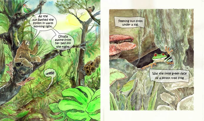
 
Page 4
 
This page is pretty much unchanged. Extra care was taken to prevent the background and foreground getting mixed up.
 
 
Page 5

Some small but I feel significant changes here. Panel 1, I took out the heroine that way we, the reader is placed in her shoes and the boy is talking to us. This way the reader isn't trying to look past her shoulder and head to see the action.
 
Panel 2&3 are the same except for the heroine is now looking where she's running.
Panels 4,5 & 6 I altered the panel sizes, this way things don't feel as cramped.
Also I purposely left no room for dialogue as there is none for these 3 panels.
I wanted the final panels, 7&8 to be more connected with the characters talking before a small action that requires neither character to move from the spot.
 
Page6
 

Final one, again some small changes I felt it would be better to include the two heroes in panel 2.
Though I usually don't like seeing the back of character's heads I thought it was appropriate in this case. The boy stands rooted looking in awe at the fire works and I thought this would be best left to the reader's imagination. This contrasts with the heroine who's already past caring and has turned away to smugly blow the smoke from a flare gun.
 
The villain is given more room for his monologue and also is seen departing but there is a sense that he's close enough to the explosion that it illuminates him.
 
The final panel is again very similar but shows the heroes returning to the Trusted Lion rather than  waiting and chatting.